
Increasing telecom customer loyalty by fixing self-service (mini-study)
My role: UX strategy, planning, oversight, and stakeholder communication for our 4-person design team.
Opportunity
A privately-owned telecom needed to bring digital servicing closer to par, as the threat of competition became a reality and raised the bar on customer expectations. Their engineering vendor had never worked with a design team before, so we also ensured they could apply and extend the guidelines as their roadmap evolved.
Goals
Meet airtight user experience expectations: “It just works”
Improve findability of priority customer workflows
Provide a more visually cohesive experience
Enable the product team to scale the experience by making it easy for them to understand and correctly apply patterns and components
Activities & deliverables
Heuristic evaluation: Full findings report and stakeholder presentation with issue descriptions, severity and frequency scoring, criteria categorization, and visual references.
Foundational UI artifacts: Before-and-after site maps and user flows, wireframes, annotated high-fidelity mockups and design component library (Figma).
Key findings & recommendations
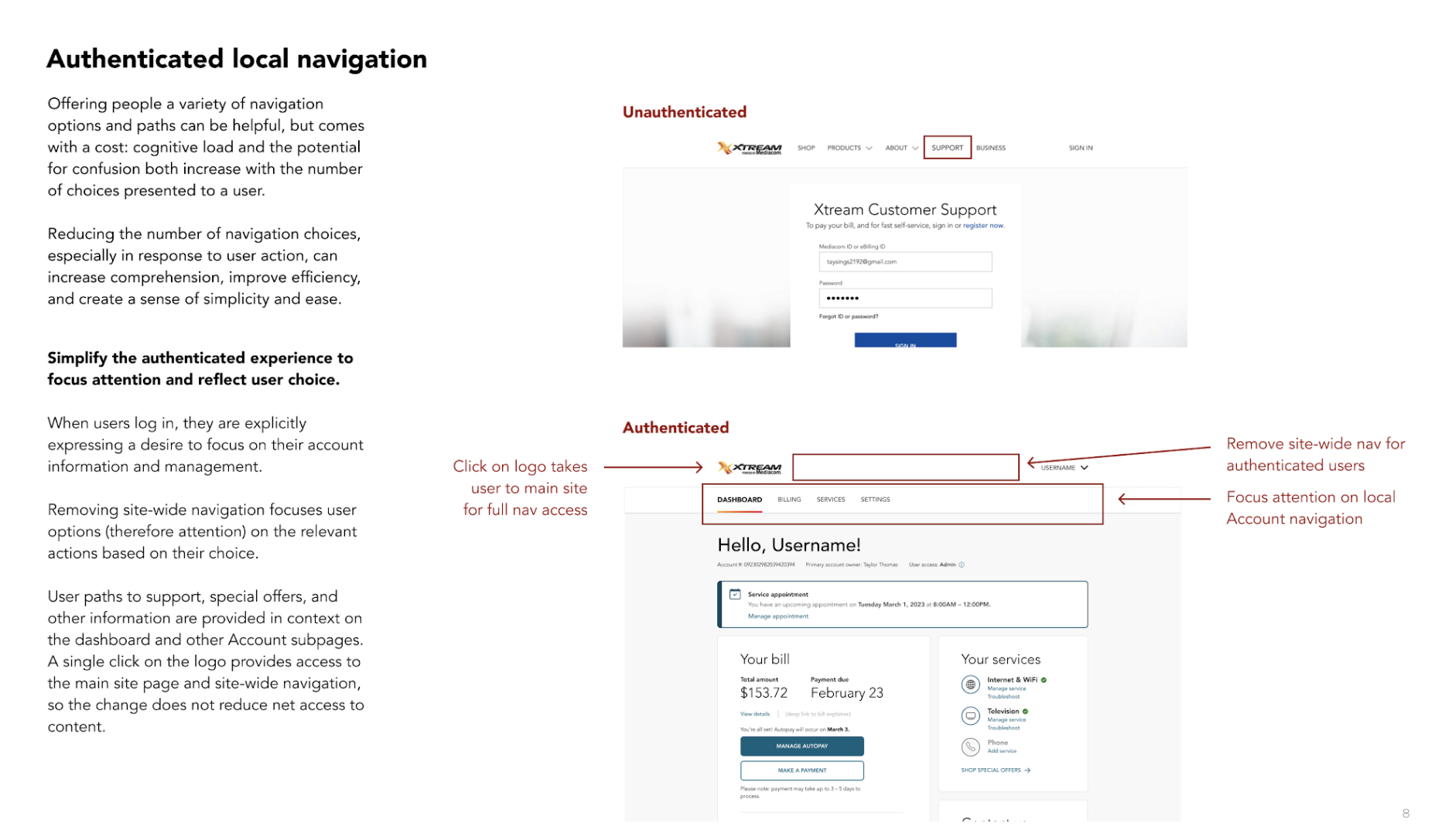
Navigation needs to match customer intent -- “I can easily get where I need to go”
Clarify: Relabel and restructure primary and secondary navigation.
Consolidate: Group related navigation options together.
Streamline: Consolidate dashboard navigation to make options clear and focused on customer priorities.
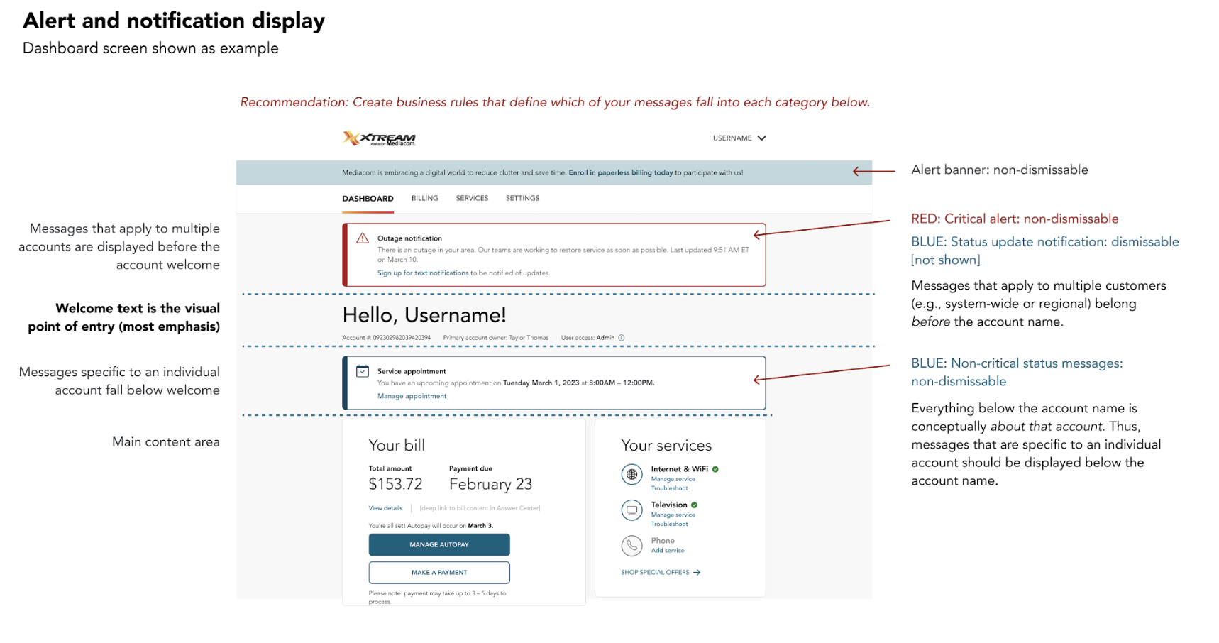
Create consistency and standards to build customer confidence -- “I feel I can rely on the information I’m getting”
Consistent navigation: Use consistent navigation paradigms throughout, and use navigation controls that match user expectations (based on external consistency).
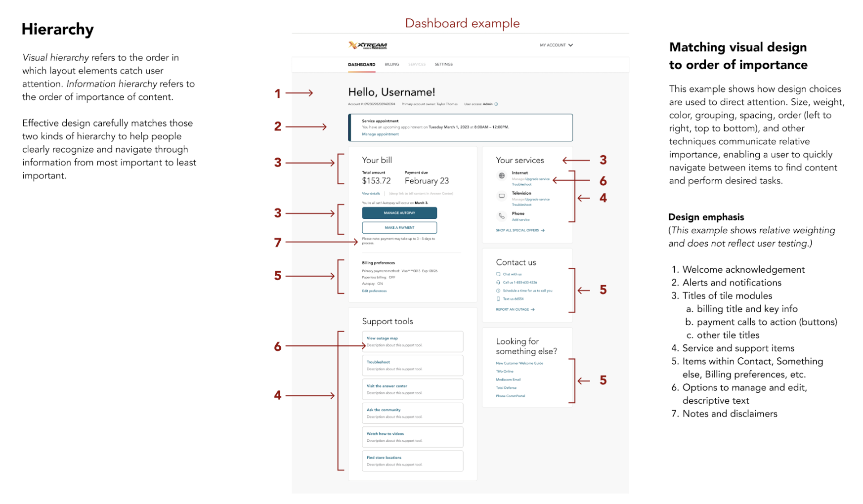
Align layout and visual styles with priorities: Consistently and distinctively style, label, and group content to clearly signal what’s most important, secondary, tertiary, etc.
Group like with like: Bring like items on the dashboard together into visually distinctive and clearly labeled sections.
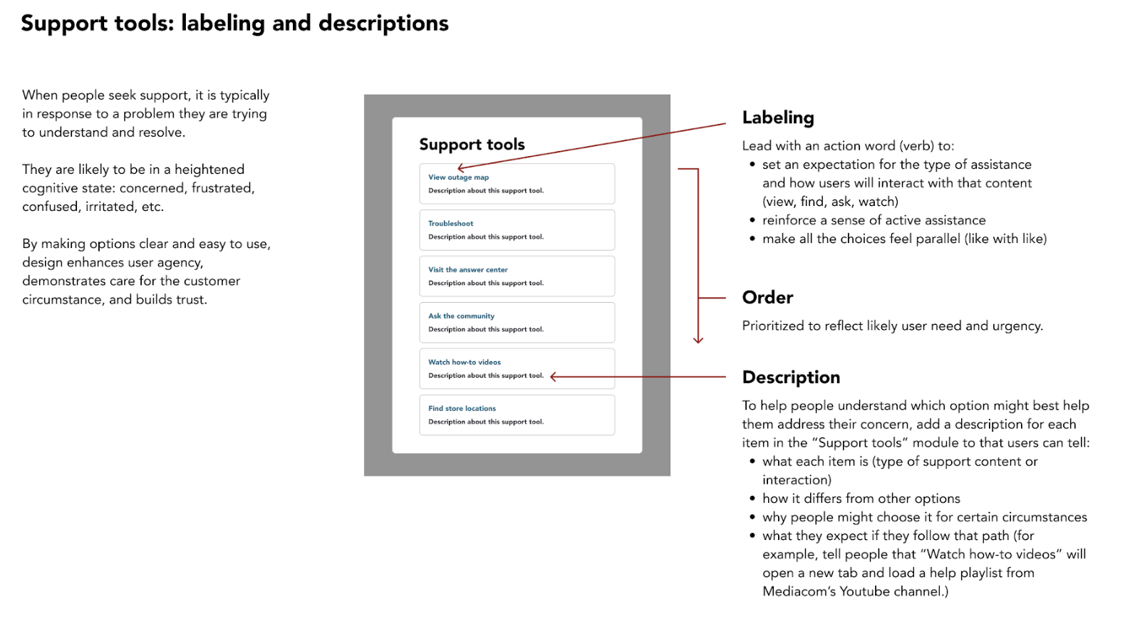
Use patterns: Follow deliberate design patterns for every element on the screen, including text style, alignment, tile labeling, and negative space.
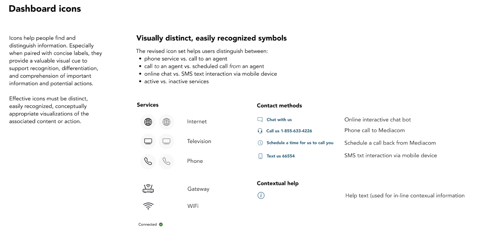
Standardize icons: Use a unique icon to signal a unique action.
Sample deliverables
Results
Our stakeholders were so delighted with the proposed changes that they began implementing them almost before we were finished. The updated experience was in production within weeks, with continued positive feedback about how easy we made it for their engineering vendor to quickly and accurately implement the design.
I also recommended they work with their vendor to implement basic user analytics, and conduct user research and testing to validate key experience hypotheses.
However, due to continued competitive pressure, it was a higher business priority to focus on creating a seamless user experience for their new MVNO (Mobile Virtual Network Operator) product. We won that work due to the success of the customer service engagement.