
Optimizing Bank of America’s mortgage experience: From a fragmented journey to record-breaking user satisfaction
My role: UX strategist, information architect, interaction designer, and lead for a 4-person design, research, and content team.
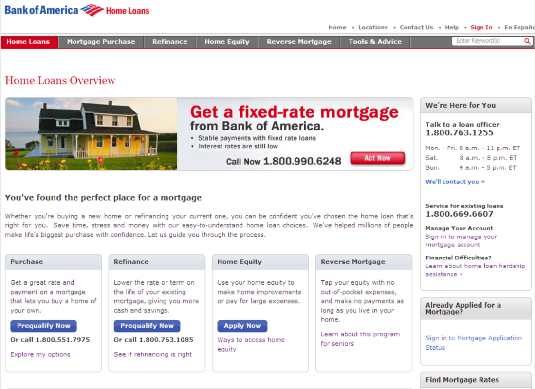
Primary site: Home Loans Sales
Standalone site: Home Loan Guide
Directing traffic to a dead-end street
Bank of America Home Lending was missing their digital sales targets. We discovered the bank’s marketing agency had created a first-time buyers Home Loan Guide, and was directing all paid search and campaign traffic to this standalone site, instead of the “official” mortgage buying experience. The standalone site had no other content and no CTAs, causing drops in sales and user satisfaction.
As UX lead for consumer lending, I facilitated conversations across siloes to align on common ground: We needed to meet user needs throughout the mortgage journey, improve conversions, and reduce the cost of operating multiple sites.
Working in a challenging context
The project landscape was complex, requiring careful navigation among 50+ individual contributors, 23 stakeholders, 14 executive approvers, and 6 siloed departments. In addition to critical requirements from marketing, sales, legal, and compliance, engineering was launching a new CMS, brand launched a new style guide, and we (UX) launched a new design system for bankofamerica.com.
We also had skeptical business stakeholders who had never done user research. They firmly believed experience decisions should be made by product owners and multivariate testing. They were certain that talking to users would skew results to meet a hidden agenda. To reassure them, we included them as contributors, approvers, and observers in all research activities. We also recruited a high number of research participants. This helped our stakeholders feel confident that user research insights were valid.
Establishing guiding principles was critical
With competing priorities and conflicts among our siloed stakeholders, I quickly realized we’d need clear guiding principles to help keep work on track:
Prioritize stakeholder engagement
Lead and validate thoroughly with extensive user research and testing
Put user education first to ensure a safe, trustworthy experience
Make products and pricing clear and visible to support SEO and sales
Leverage new brand and design systems
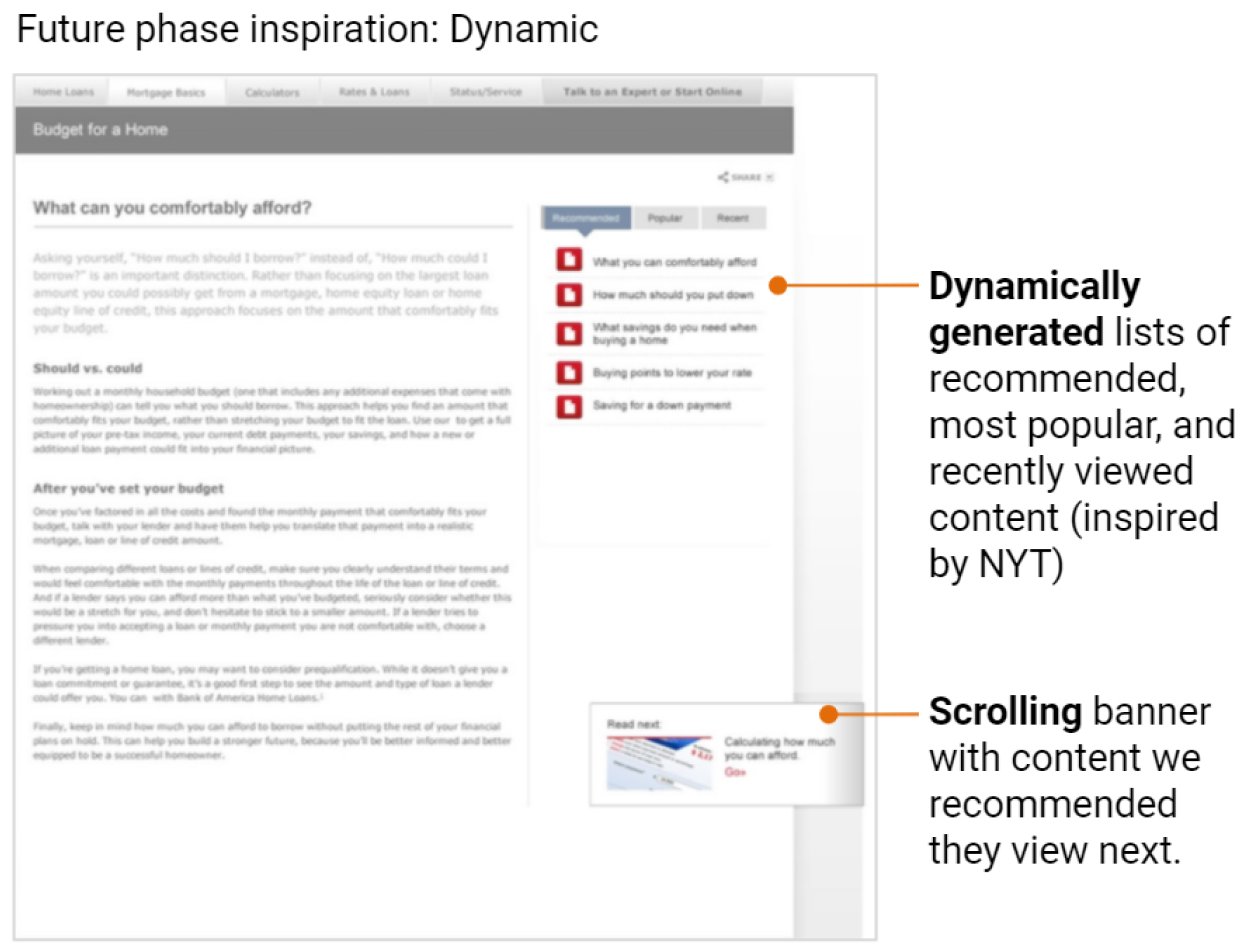
Allow for future phase concept exploration
Finding out what users really need
I interviewed key stakeholders and subject matter experts, reviewed user analytics from current sites, examined previous user research insights, and learned the end-to-end mortgage sales processes.
Simultaneously, we conducted extensive usability walkthroughs and user interviews with 40 participants (covering multiple personas and scenarios), with a goal of validating assumptions, and discovering unknown needs, preferences, and behavioral drivers.
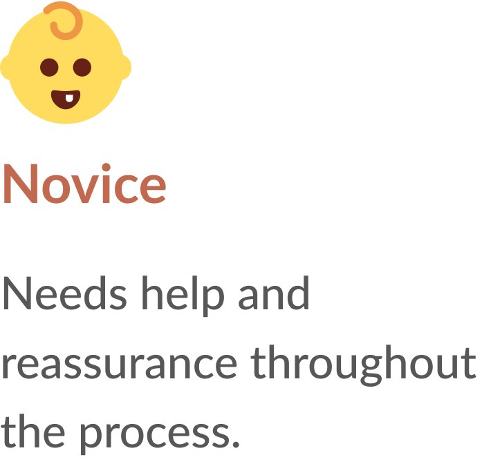
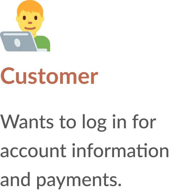
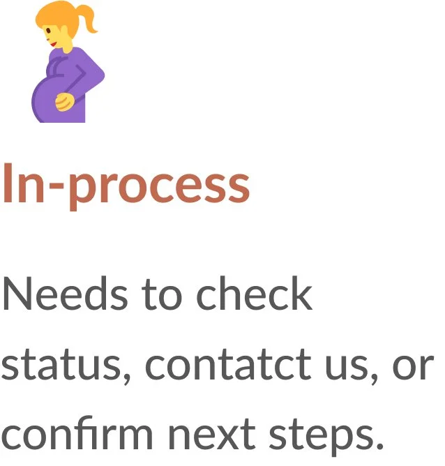
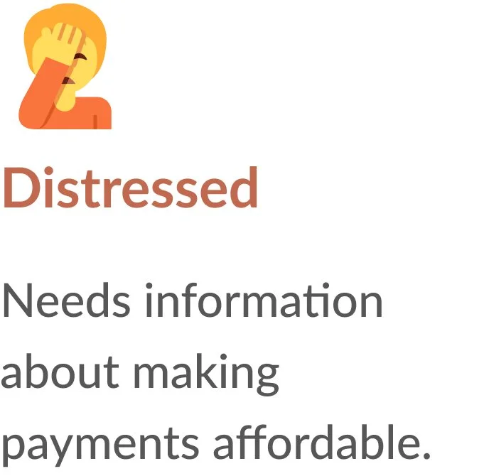
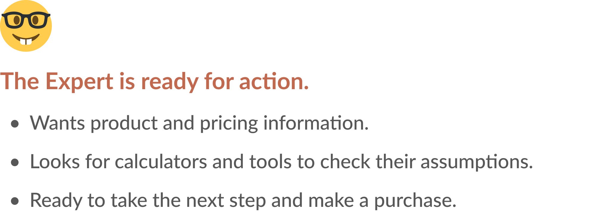
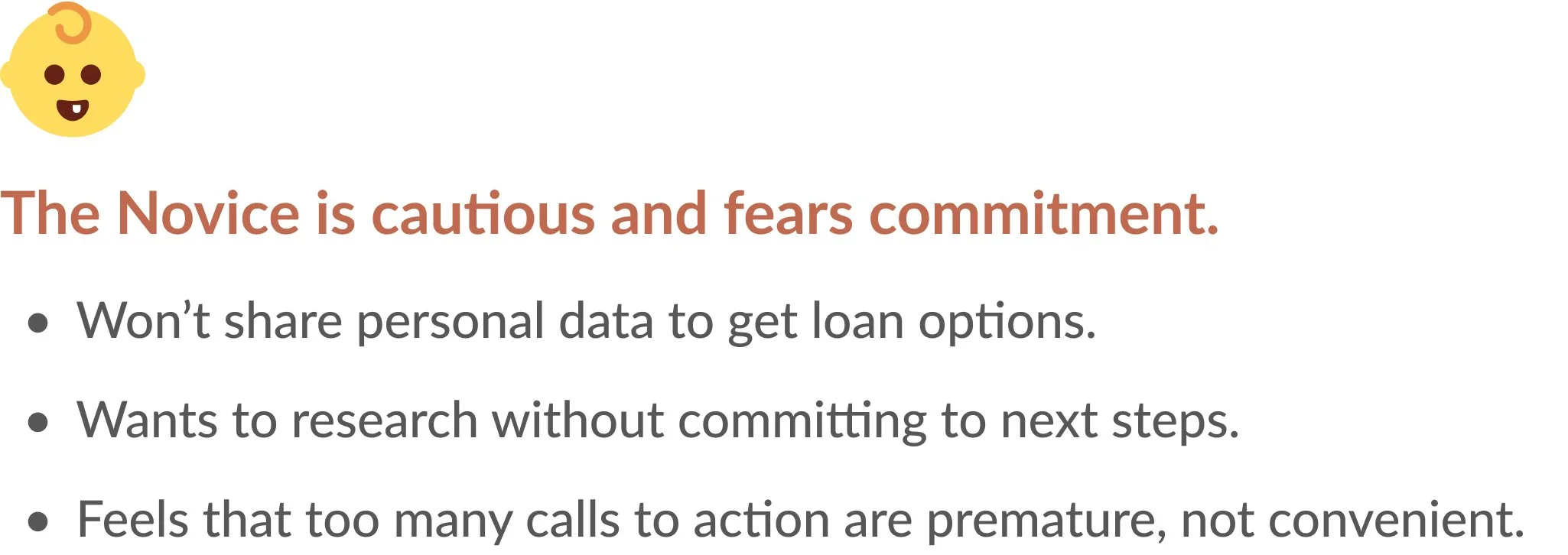
From this foundational research, and underpinned by our existing consumer banking personas, five behavioral archetypes emerged, with Novice and Expert behaviors (the two most common) as our highest priority:

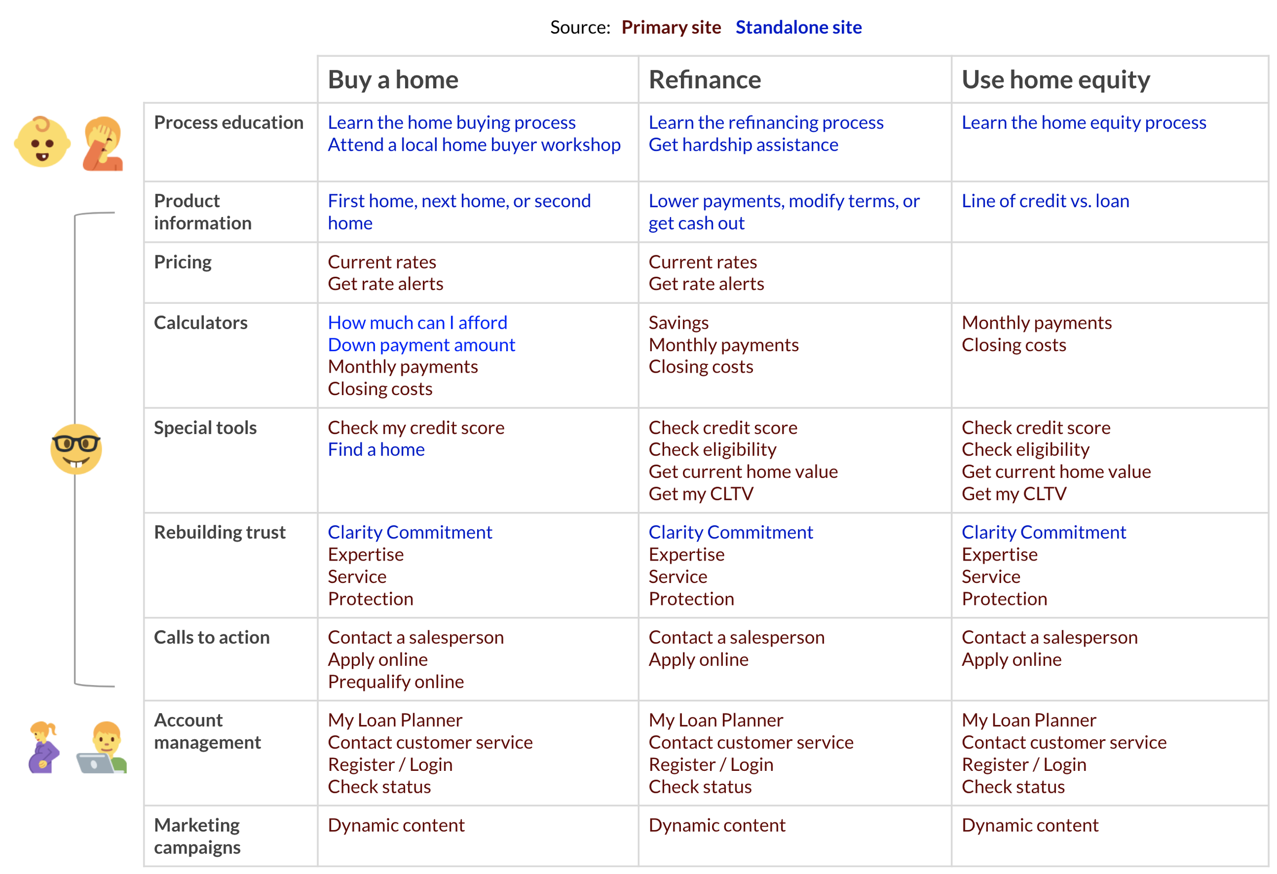
Streamlining the information architecture
I comprehensively inventoried the content and features from both sites, and then organized them into cohesive categories, solving for redundancies. With consideration to our guiding principles and priority archetypes, I created a preliminary integrated information architecture.
Receiving positive user validation
Next, we conducted open card sorting and sample content evaluations to inform and validate this IA, as well as the potential to repurpose existing content.
All samples of existing content garnered positive responses and could be repurposed with minimal editing. This was particularly good news, as it expedited legal and regulatory review.
I had a clear understanding of business and user goals. The scope and approach to content integration had been confirmed by real users. I could confidently move forward to designing navigation.
Collaborating on navigation
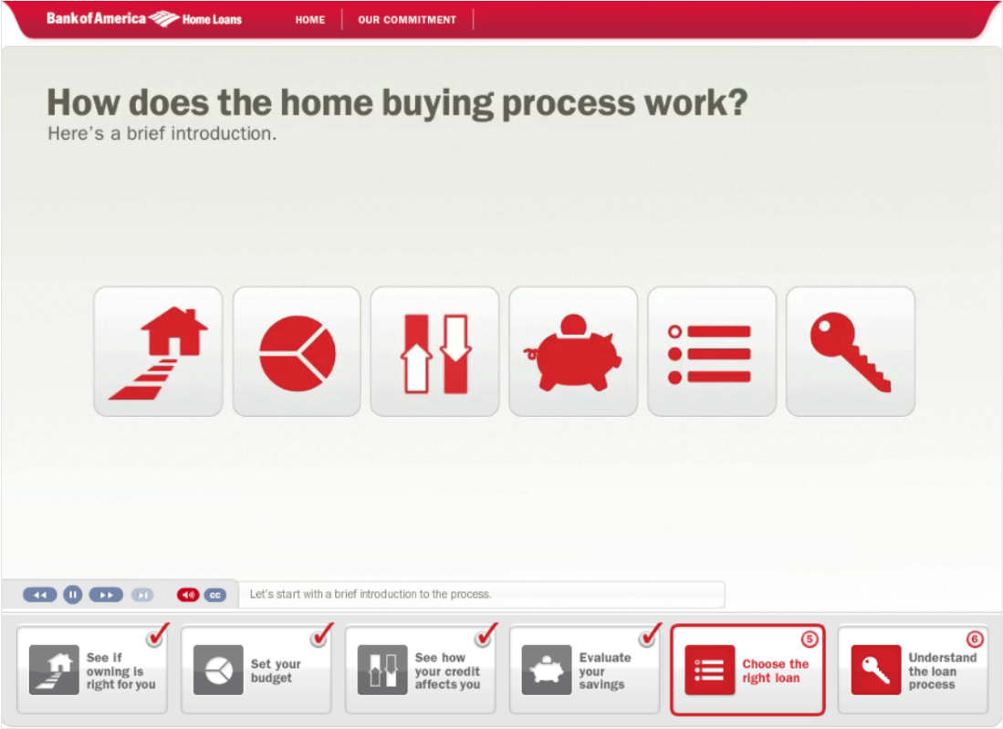
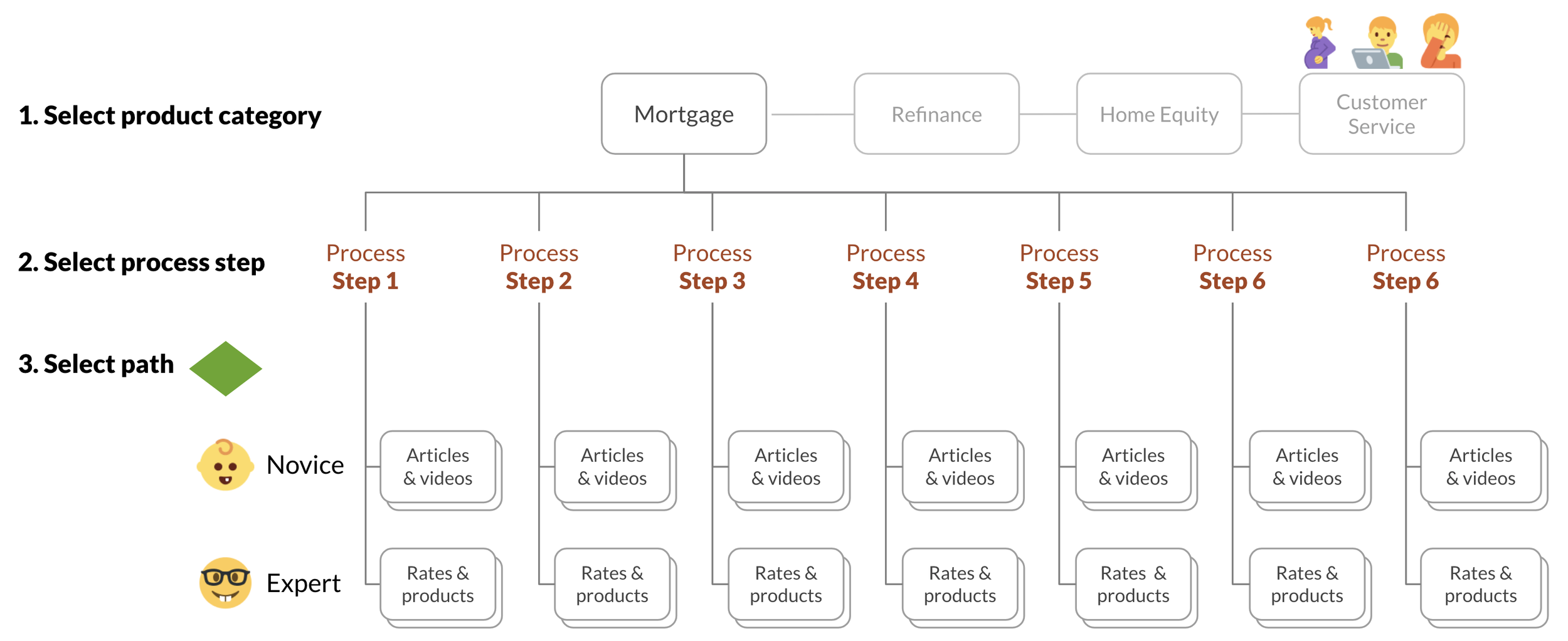
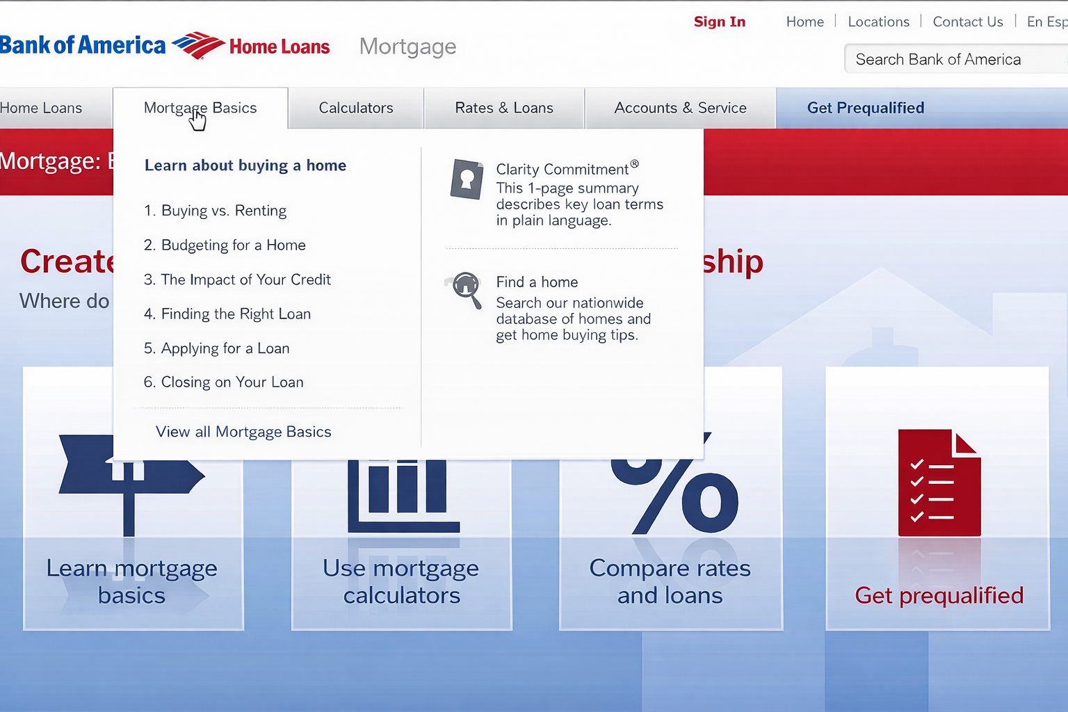
In combining the sites, we repurposed the concept of process steps as mandatory navigation, in order to preserve the standalone site’s approach to Novice education.
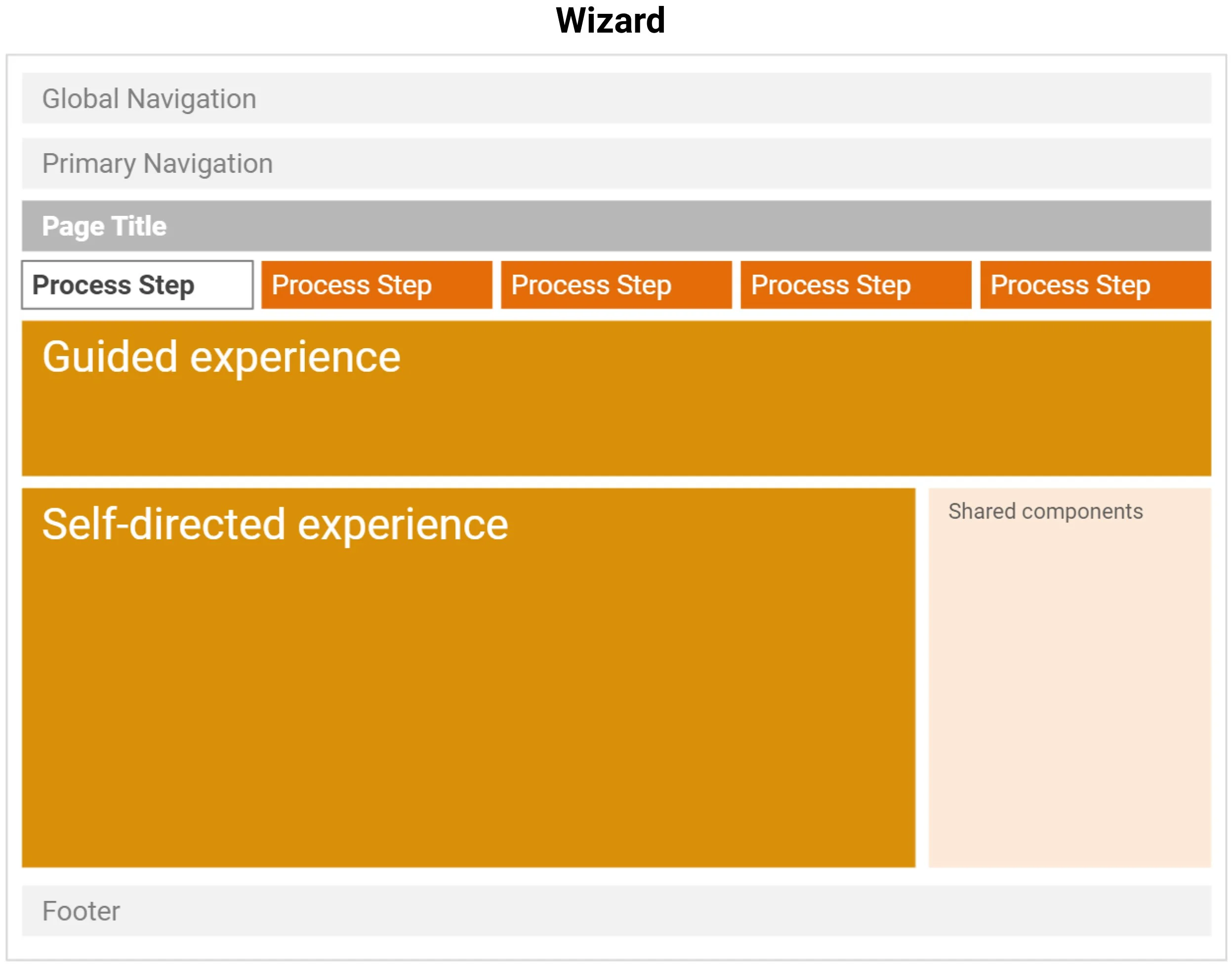
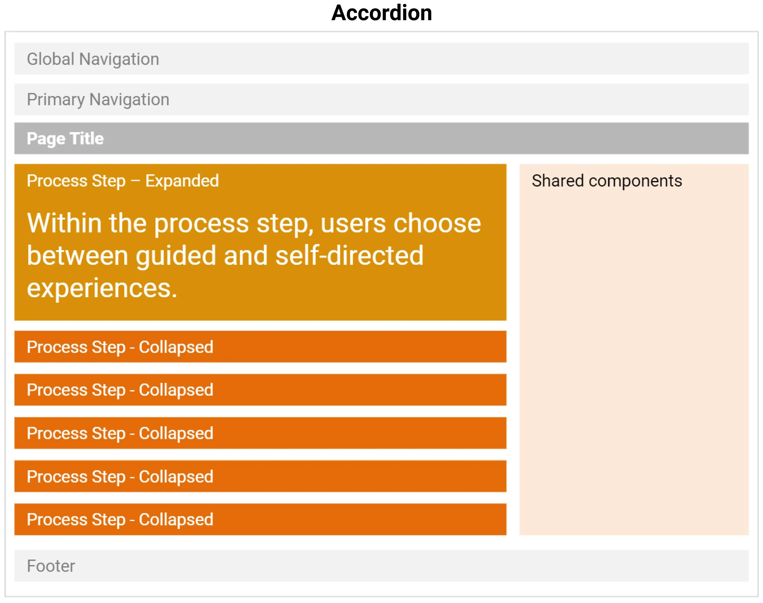
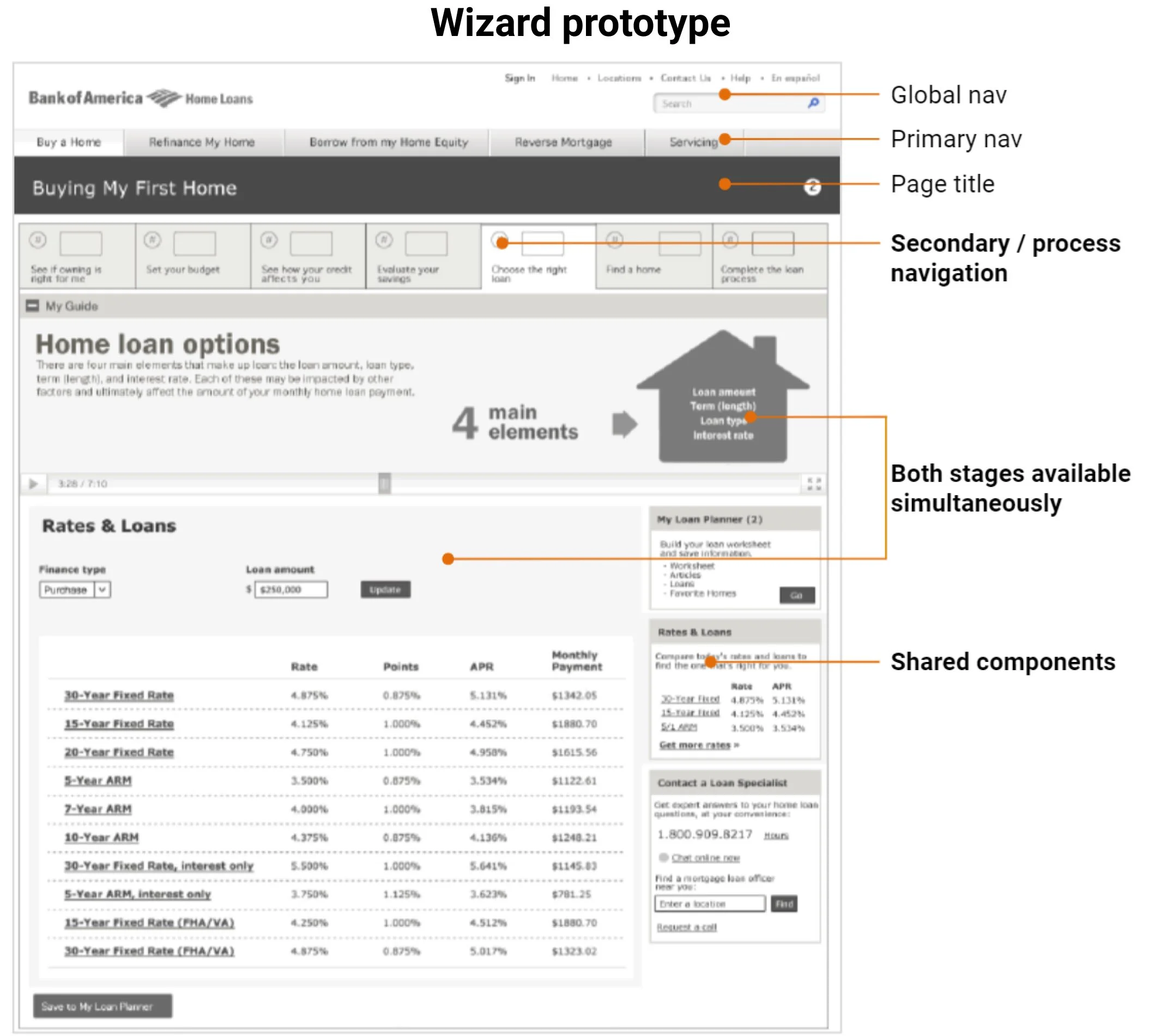
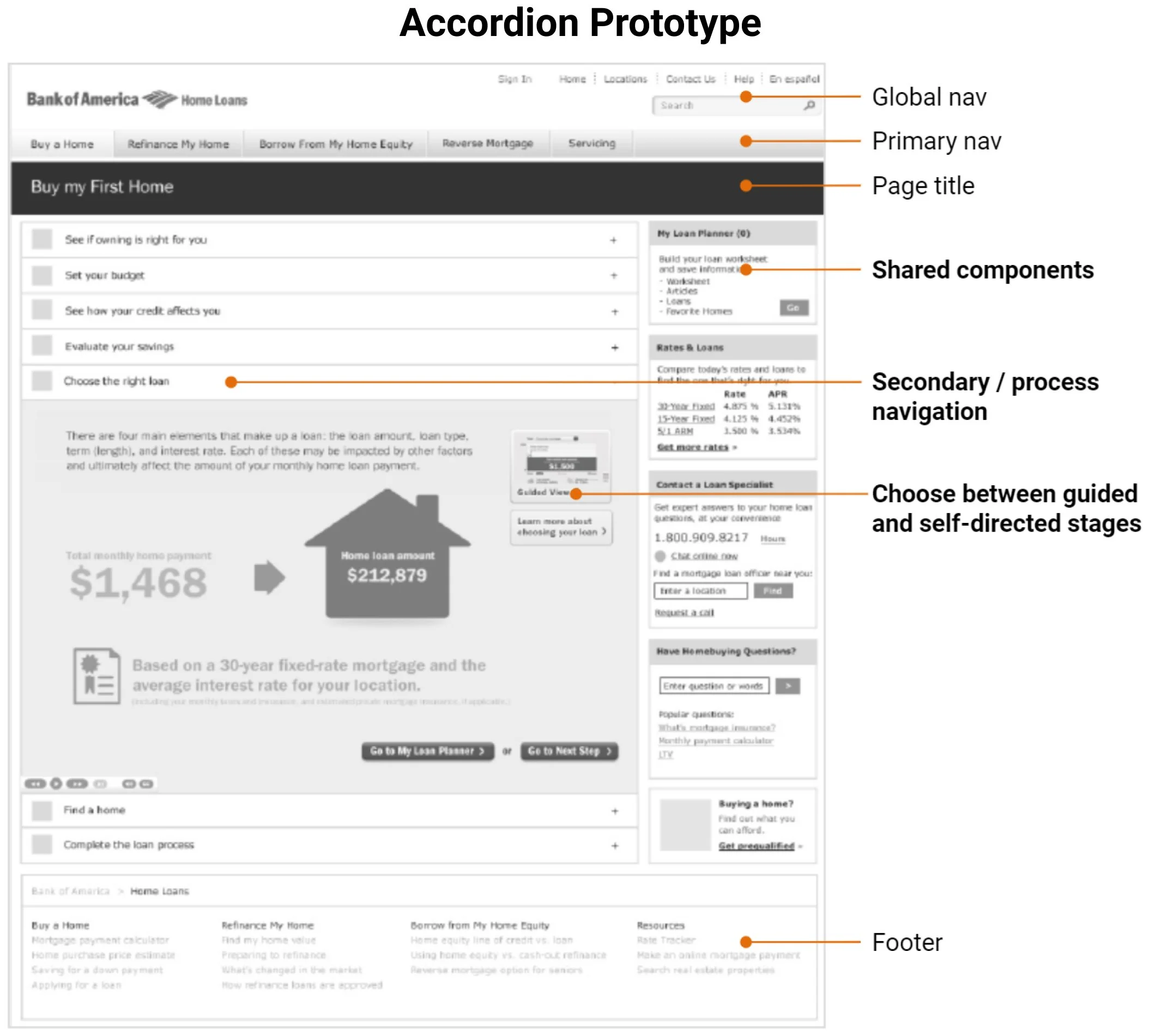
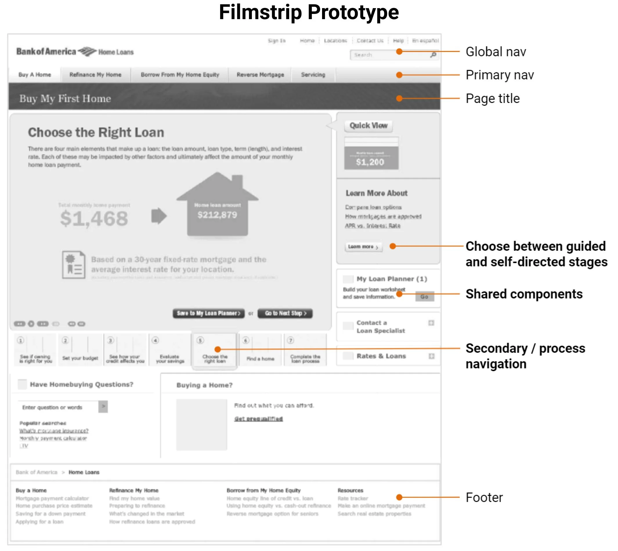
We needed effective secondary navigation design for process steps. But, the new design system did not have secondary navigation patterns. Through joint design sessions with the marketing agency, we co-created three secondary navigation concepts: Wizard, Accordion, and Filmstrip.

Seeking user input on a key navigation decision
This navigation design was a high-risk decision. We decided to prototype and test the options with users. We quickly pulled together 3 mid-fidelity prototypes, each with about 40 screens, and structured the test to evaluate:
Relative learnability and usability of the competing concepts
Ability to choose between guided vs. self-directed experiences within each step in the process.
Other qualitative user feedback on layout, content, ease of use, and overall satisfaction.
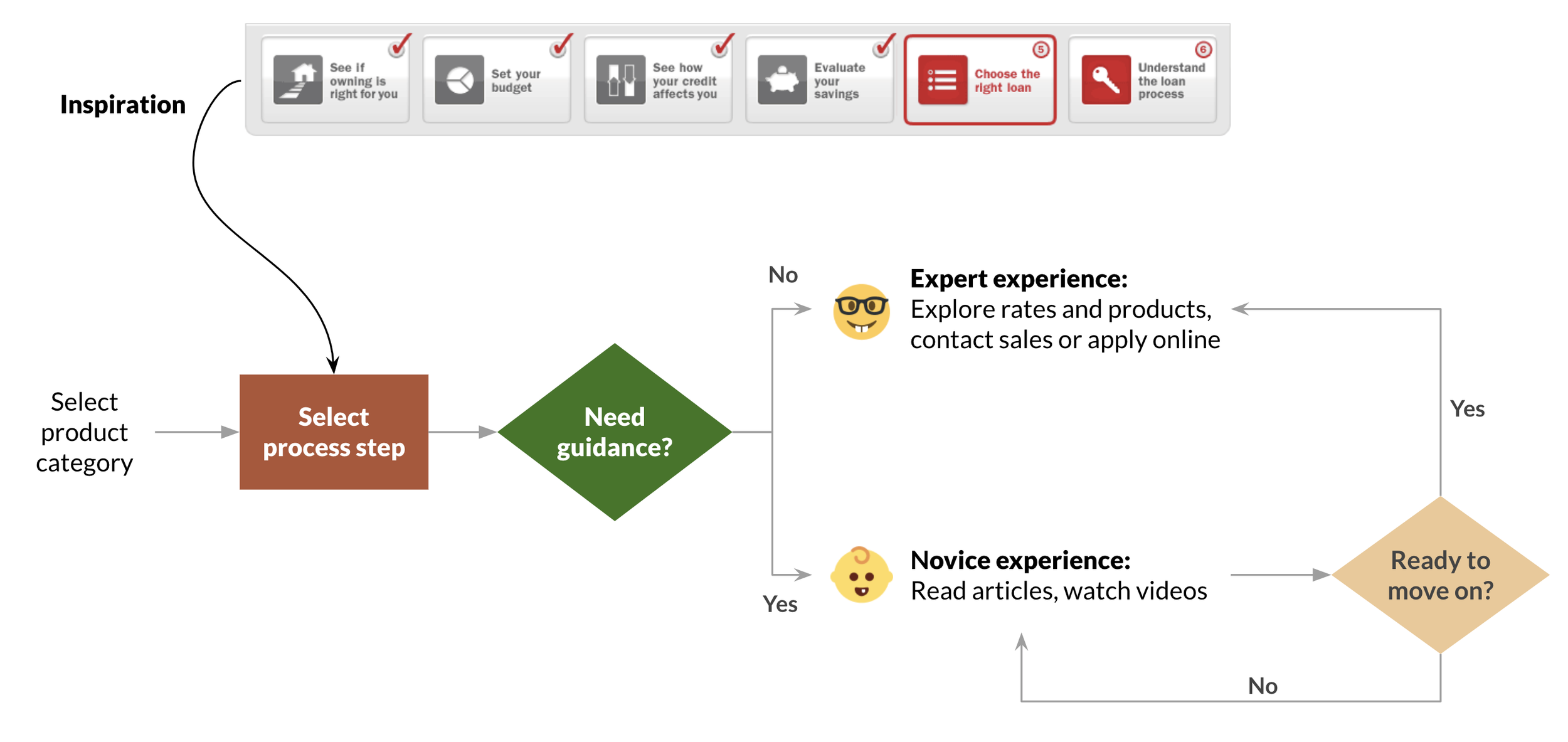
Uncovering a big miss
Our testers found that all three options provided a generally usable site that prioritized their needs. They were satisfied with the visibility of rate information and tools. Plus, they felt product information was easy to access, with an appropriate level of detail.
But, having to choose between Novice and Expert experiences was a significant usability failure. When presented with that choice, users could not accurately predict if they would need guidance. For those that said they were certain, their actual behavior proved otherwise.
Removing high-friction decision points
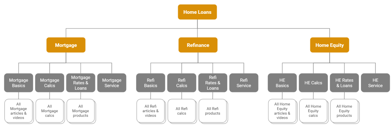
With this crucial insight, I simplified the structure, eliminating the need for users to choose process steps and knowledge paths, and instead enabled flexible access to all potentially relevant content. Key information and tools were also made more visible by moving them up in the hierarchy.
From this:
To this — users no longer have to choose a process step or predict their need for guidance:
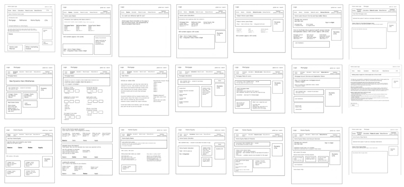
Creating detailed design specs
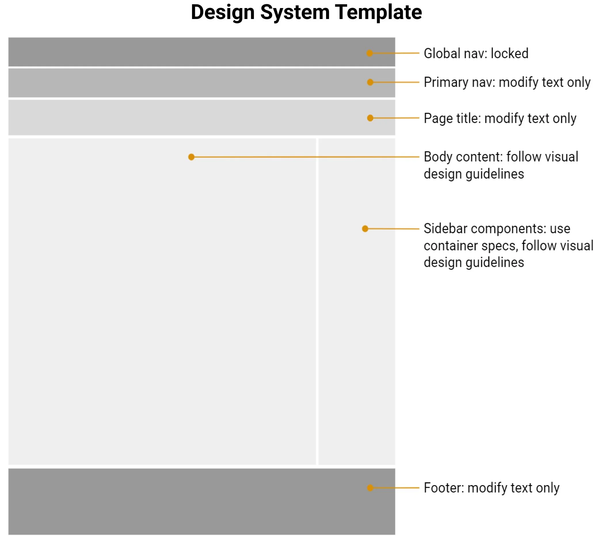
Now that the site structure and navigation were locked, I dug into the details. Because I was using existing content, existing functionality, and the new design system, I decided to produce standard layout templates for each page type, referencing the repeatable content and components. This approach would speed up high-fidelity design and development.
Evolving CTA design and function
I needed to create net new components for dynamic CTAs, menu-based CTAs, marketing campaign integration, and contextual navigation.
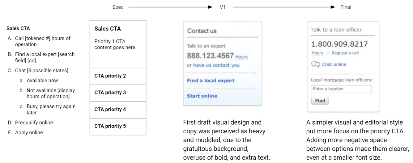
The CTA component was complex, displaying any permutation of 5 different channels: phone, chat, search for a local salesperson, apply online, prequalify online. Business rules were applied to dynamically change the component at the page level, so that traffic would go to the most optimal channel(s), in real time.
Adding prominent CTAs
Business stakeholders were concerned the integrated site had too few CTAs. Because the primary navigation was now so simple and straightforward, I took the opportunity to add an extremely visible and persistently findable CTA.

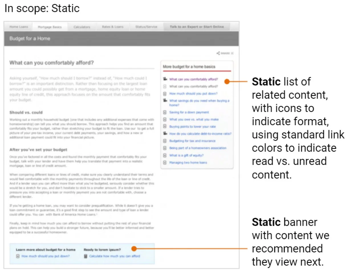
Exploring contextual navigation
As users reviewed articles and videos, I wanted to offer easy ways to identify content they had already viewed, content we recommended they view next, and the content format (text or video).
I designed contextual navigation to keep users engaged, with a clear path to related content.
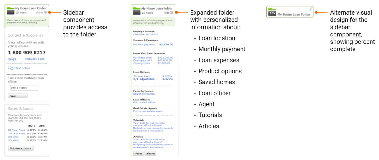
Concepting multi-session experiences
User research had also revealed that people expected this process to be complex and time-consuming, and anticipated the need to make multiple visits over time. I provided inspirational designs for a future My Home Loan Folder feature that could track and communicate progress. User must-haves for the experience included: retrievable over multiple sessions, helpful in completing the application, visible status and next steps, and shareable with partners in the process.
Getting positive results from final usability testing
We conducted one last round of usability testing, with an objective of determining if the structure and navigation was intuitive and usable, and the ability to complete 12 specific tasks for each of the product categories. The results were definitively positive, with only minor issues that could be safely revisited after launch.
Preparing final specifications
Calculators and other tools needed to be re-engineered as part of CMS migration, but there was no existing functional spec. I worked closely with subject matter experts and engineering teams to completely document all the business rules, so these features could be coded and tested.
During this project I developed a close and trusting relationship with the engineering team, particularly the QA lead. Our daily conversations gave me insight into her biggest pain point: no single source of truth. This was the pre-Jira era, so I devised and maintained a spreadsheet that included, for every screen:
Links to the wireframe, component specs, assets, copy deck, and functional specs
Metadata
URL redirect mapping from the two existing sites
UX, dev, and QA status
Running the approval gauntlet
We needed approvals on the final designs from 14 different executives across 6 different silos, each with their own process and criteria. As UX team lead, I navigated and negotiated to get these boxes checked.
The only notable glitch was the accessibility review. Due to technical constraints, screen readers could not interact with overlays nested inside other overlays. Thankfully, this was a rare occurrence (a few glossary terms inside calculators), and it was simple enough to remove the extra overlay.
The result: Satisfied users drive better business outcomes
5x increase in CTA pull-through
Annual online mortgage sales exceeded $1 billion
Record high customer satisfaction scores
Ranked #1 in digital sales functionality (Forrester)
Looking back on a growth opportunity
Integrating the home loans experiences was a long and challenging journey. I was able to practice and deepen important skills:
Staying focused on our users
Prioritizing information architecture
Executing with speed and quality
Guiding and supporting a multi-disciplinary UX team
Managing stakeholders across a large organization
Developing and applying business knowledge
Collaborating with engineering
Having grit and perseverance through it all
Putting people first
This was a large and complex project inside a large and complex organization. In situations like this, I’ve found success in:
Providing a clear and consistent vision that everyone can understand and connect with.
Treating stakeholders like users, focusing on their needs, pain points, and delights, and trying to make their experience of working with UX as delightful as possible.